Uncategorized

Gotta Catch Them All!

Image

It is pretty amazing how long ago this game was developed. Pokemon started a whole franchise of toys, plush toys, collectibles, games on different platforms, cool kids, data transfer cable on gameboys, addicts, etc.

What’s amazing about this game was that, when it was first launched, kids accepted words like pokedex, pokeball, masterball, something-ball, pikachu, charmander. We absorbed it, we caught them all, then they launch new versions after newer versions. Gold is not the first version. But the gameplay is exactly the same. In the original, we start off as Ash. In this version, you start off as Gold.

You are given 3 pokemon to choose from of which they are either the Fire, Water or Grass type. Now experienced players know not to choose Fire Pokemon 😀 Thats right, cause the first 2 gym trainers would whooop your ass. First gym is rock, second is water. Haha.  All those memories.

Anyway enjoy this video, takes you back to 8 bit gaming days.

Pokemon Instavid

Standard
Uncategorized

10 Ways How Losing the Internet Made Life Quieter

1. My Mum’s Cable Tv got cut

Believe it or not, she probably consumes the 2nd most amount of energy in the household(on tv alone) just after the fridge.

2. My Dad’s Cable Tv got cut

Because of work he is confined to the spaces of time on TV just after work till bedtime, and the weekends, and public holidays, and off days.

3. I spend more time coding.

Rather than mindlessly scrolling Facebook, I actually got down to coding hardcore, without even surfing stackoverflow for answers.

4. I got brighter

Stackoverflow increases my dependance on other people’s answers. Without Stackoverflow i actually have to think my own way out of a problem. WOOPEE!

5. The surrounding neighbourhood sleeps earlier

No more late night soccer. No random MTV music. No aunty watching Korean drama.

6. Reduced HUM of the power substation.

With lesser people using their PCs , TVs, the substation works less. OMG our first step to a green revolution!

7. I got down to blogging.

I am not trolling youtube for the first time. So that means i have spare time to blog using my mobile’s data.

8. A Zombie attack could be looming

Without the mindless drum of 24/7 social media, a zombie attack could already be happening. We wouldn’t know about it. Before long, when we all turn to zombies, the world will be a quieter place.

9. No Homeland

Having said that, i believe i was in the midst of downloading Homeland. Hmm, what to watch now?

10. I space out from time to time

Between intervals of 20 Secs, I lose focus and start to think what life was like before the internet, cable tv, mobile and rotten cheese. I stop talking all together.

Standard
Tech

The iPhone 5s – Space Grey

Hello all,

So I managed to purchase a 16gb Space Grey iPhone 5s on launch day. There wasn’t a queue. I picked up a ticket, got called the moment i blinked and on my way to a shiny new iPhone.

Unboxed

My previous iPhone was the 4s. The 4s wasn’t quite the disappointment, or neither was it ravishingly handsome like the 5s. I like the chamfered edges. I like the sleek look. I like the new colours. Honestly, I was getting really bored with the black or white combo. It almost felt like Michael Jackson could endorse the phone. Then came along space grey. To be honest, i was looking forward to the gold or the silver ones. But heck space grey looks just as neat. See below. I was using the developer before, wasn’t going to wait to restore the phone back to where i left off.

The moment of truth.

The moment of truth.

The edges makes it easier to hold.

The edges makes it easier to hold.

Touchid

The all so easy way to unlock the phone

The all so easy way to unlock the phone

Apple has promised that no fingerprint will be uploaded to anywhere other than a secure location within the depths of the hardware of the A7 chip. Now how will people react to that? Will they not use Touchid because they fear their fingerprint will be hacked eventually and people will start forging their identities? Humans are born reactive. So no. I have stored 4 fingerprints in Touchid because i fear that one day when I eat a chicken wing and might need to text, I will definitely not want to be left stranded without a clean fingertip. Having said that, i could still key in the 4 digit password to unlock the phone, but think of the inconvenience!

TAP TAP TAP: How Touchid makes your life a little less complicated

Apple has carefully crafted ways to make sure that your experience is as uninterrupted as possible. Think in number of taps. First tap, home button. Second tap, swipe. Third tap, 4 digit password. That’s 3 taps before you reach your destination. Now with touchid, you needn’t even swipe to unlock screen! Just press home button and VOILA! 1 tap to destination! Convenience and Utility. Will Samsung and LG and HTC and NOKIA and BB follow suit? Time will tell.

Why it’s so Fast

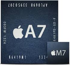
The A7 and the M7

The A7 and the M7

So I believe most people think that if there are more hands, work can be done a lot quicker just like the number of cores existent in a processing chip. It’s been proven that even with 4 cores, apps may not run as quick as you would like them to be. Reason being, your apps may not even be coded to utilize all cores.

Think of it as having 4 people in a factory line but not all of them are working cause maybe only one has been assigned or has the skills to work. So Apple has chosen A7, a 64bit dual core chip which has been proven at a website running tests, to be super fast. What does that mean? Less lag. More efficiency. Less battery wasted. More battery life time.

M7 a motion co-processor is touted to be the next generation chip to reduce battery dependency and usage. It senses Gyro Motions and has its own internal bettery, hence you get more battery life. Simple and Easy.

Faster Browsing, Surfing

Apple has been caught shipping a product with a relatively new networking protocol called Advance Multi-Path TCP. It basically gives your phone many different paths to seek and retrieve data. So if one line drops, another line will be working away making sure your connection for your video doesn’t stop, your browser doesn’t stop loading, etc. The technology does not belong to them. But it’s a brilliant idea to make the whole connected experience even better. Sneaky.

Camera

Don't know what it means.

Don’t know what it means.

The camera may only be 8 MP. But the pictures are still pretty stunning. They have gone with an explanation of how their flash works and makes the whole night flashing experience better. I think NOKIA pictures are still nicer though.

Why I Bought It

The iPhone remains a stunning experience phone. It is not cryptic in a way which makes smart people look dumb. It is not like water and oil. It’s soluble like salt and water. Just use it. The apps which developers make are usually out of the way spectacular, at least the top 10 featured apps are. Most of all, the experience makes you depend on it. However, that dependency does not feel coerced. It feels almost natural. Welcome to the age of technology.

Standard
Gaming

Fun Run – The Ultimate Game

One of the most addictive games played recently!

One of the most addictive games played recently!

I recently got hooked to this game found on most mobile devices called Fun Run. If you haven’t played it yet, please do. Its free and it’d downright addictive. The goal of the game is simple. You pit against random people around the world or with a bunch of friends (max 4 per game). All you need to do is get your avatar from the start of the side scroller to the end of the side scroller and be the first to reach there i imagine.

Imagine Mario meets Resident Evil. Yes that’s right, Resident Evil. The game only has two controls. On the bottom left side, you are equipped with a random item when you start. The item either stops your frienemies in their tracks with samurai sword slashing, lightning bolt zapping animation or pulls them back with magnets, or gives you a running boost speed or gives you a jump or throw a slicing blade forward or leave a box which pushes you back or leave a trap which bites your avatar head off. I am not sure if i have missed any of the fancy items out. On the bottom right side is a jump button. The avatar moves “forward” constantly and all you have to do is avoid obstacles and jump.

Its an outright simple game. However the moment you play with a group of friends, you begin to wonder when and who called for the last game to be played. Its a must try. It can be enjoyed by Girls, Boys, Fathers, Mothers, Gentleman, Ladies alike. Its a no brainer, choppy graphics, but the fun makes up for it. Hence the name.

Standard
Tech

A Beginner’s Guide – Building Your First Mobile App w/o a Computer

When i was handed my first book on iOS development, Wow. It sucked. I was thrown off course, the book laid me out on the road naked. I jumped straight into the programming. NO! STOP!

If you fail to plan, you plan to fail. Cheesy as it may be, you will need to layout the drawing board. Don’t even think about paying for the developer fees. Do not download the tools. Just pen and paper or photoshop. This Link allows you to download a Mobile Template PSD file. The template is pretty much every thing you need to start planning out how your app will look and strangely feel.

1. Tab Bar

The TabBar is a Quick Switch Tool

The TabBar is a Quick Switch Tool

You have used it on instagram or on your music apps. The tab bar gives your user a basic overview of all the available “Utilities” or “Categories” your app wants to show off to your user. I want to allow my user to , take photos, share photos, look at photos, make profile settings, look at a feed, look at a wall of pictures, look at a collection of videos. The list goes on. The tab bar sort of gives your user the feel of being able to quickly access information without having to navigate through a million pages.

2. Navigation Bar

The navigation bar gives a sense of direction.

The navigation bar gives a sense of direction.

The navigation bar gives your user a sense of placement. It displays the title, back button , more actions button. If you are looking to guide your user from one point to another, the navigation bar is the most critical element of the screen. For example, you want your user to fill up a form, do a survey, display a linear path. The back button tells the user they can move back to before, the title gives a sense of direction/placement. Remember this well.

3. Tool Bar

The toolbar provides quick at-a-glance functions for facilitation.

The toolbar provides quick at-a-glance functions for facilitation.

In the standard tool Mail app, Apple’s iOS designers have successfully conquered almost all corners of what a user should encounter. The tool bar as it’s name suggests, provides tools for the user to utilize to make changes or enhance the current page setting. For example, forward mail, reply mail, add a border to my picture, add a filter, add red eye, blah blah. Its like a handyman’s waist pouch, they never seem to fail to always be able to pull something out from those little pouches.

Going Forward

With these 3 basic items, you should be able to design about 50% of the apps out there. Keep in mind your functions, utilities, purpose. Say you want to build a foodie app for your users to just salivate at loooooots of pictures, on top of which displays categories based on cuisines, you might want to use a tab bar to  show the different cuisines by selecting the food tabs.

Naturally the ultimate question would be, what purpose does your app serve? You want to build your own expense tracker, your own camera social feed . Hold ON! The app store already has a million of those!? So before you begin, always work out a purpose. Build something you genuine feel has a good use for you and others out there.

Watch out for the next post on Table Views, Scroll Views and etc.

Standard
Tech

Augmented Reality and The Deathly Hollow.

This IKEA video below demonstrates what our ancestors in the tech field have long been talking about. Augmented Reality.

AR is a term served upon the public on a cold dish by a bunch of techies posing as waiters. The only reason why you don’t know what it means is precisely why it has not taken off yet. AR is really just placing things in your video camera’s line of sight in real time and make them “exist”. Remember Virtual Reality? Yep that means you lived through the 90s.

Really ugly VR tech. It looks sterile.

Really ugly VR tech. It looks sterile.

Those were the days. Love the 16-Bit graphics. So blocky. So there.

Those were the days. Love the 16-Bit graphics. So blocky. So there.

So that means you take away the ugly camera on your face, and take away the blocky hands, you get AR. IKEA’s advertisement has pretty much summed it all up. To add on, AR tech has seeped into some of the not so popular apps(if i can’t name them, it means i have browsed them on the internet once, scoffed and gave it no second thought). These AR “Deals” apps, combine your gps location, your camera pointing in the general direction you wanna go to, and deals(shopping, restaurant etc etc) pop up in the direction you point the camera towards. Smooth and Fuss Free.

WHY?

Why aren’t they popular if the founders of these apps say it to be as convenient, lifestyle-ish, frontedge-of-technology-ish, BS-ish as they are supposed to be? Well socially, the human mind, or society as a whole hasn’t moved on to accept “starters” technology as convenient or user-friendly. Understand that we have been consuming the “Main Dish” technology for about 10 years before the invention of the iPhone. The “starters” are software/apps on our phones, “main dish” = nokia/sony ericsson/motorola. Get it? We didnt use to eat calamari or tuna tartare to fill our stomachs, we ate burgers or steak or chicken rice to stay full. Likewise, apps weren’t the main dish until recently. App usage has pretty much become the key reason why smartphones sell. Role reversal. We now go to this Steakhouse because it sells the most beautiful eggs benedict. Yum.

Backtrack to the Main Topic

Remember playing snake on your NOKIA? That has become common staple, hence we accept games on our iPhones and Androids, thus we continue to download and play for entertainment. 10 years ago, whenever i held my phone up and pointed it in the general direction of the sky, it would mean that i didn’t have reception. Today that still stands. There i have made my point, so i don’t see AR moving in this general direction.

What I Think about AR in Future

Do i believe that Augmented Reality will seep into our lives any time soon? Nah, i highly doubt so. Could you see yourself holding up your phone in the middle of the street and start looking for nearby deals, or even, find the nearest toilet/barber/hole in the wall? I’d much rather employ the Mad Hatter to show me his version of augmented reality.

Where i think AR could Work

I strongly believe, that we could involve AR in cars. Today while driving, it struck me. Where could we easily implement technology like this? If you were driving with your gps installed in your car, have important information appear in the windscreen of where you were driving. Like see a shape of the building running through your vision in front of you while the gps navigated you :D. Can work! YES Can!

If you agree and think AR has a future, leave a note below. Thanks for reading!

More Videos on AR: http://www.youtube.com/watch?v=NqUSfjTSLyo

Standard
Tech

After i Mash, i Hash. iOS7 has hit rock bottom.

In my previous post, i mentioned i would take a snapshot of other apps in this one. Well this post covers 2 apps, Photo and Calendar. Photo is, most likely, the most used app amongst all iPhone users. Undoubtedly, everyone’s a narcissist. That means you, and you, and you. Calendar is a super utility tool which i personally use with gmail syncing. Once upon a time, Apple had problems with iCloud syncing across multiple devices. Lets not kid ourselves, we are still in that fairytale. We imagine it like how Steve Jobs sells it to us, but it works just as bad as Steve Ballmer’s vulture-looking nose. Gmail’s syncing saved me personally.

Steve Ballmer's Nose

Steve Ballmer’s Nose

Calendar App

I use this app very very often. Enough said. It’s a lifeblood for most people who make plans in their lives. With that said, the following pictures you are about to see will most likely be shocking. The amount of white space in this redesigned flat calendar is really about toothpaste. The developer, I believe, really likes white toothpaste and he/she(no discrimination) decided one morning that the calendar should really be about white white white.

before this in beta 1, they forgot to add dots to the calendar to indicate events. i actually missed a few appointments.

before this in beta 1, they forgot to add dots to the calendar to indicate events. i actually missed a few appointments.

This is the new overview of the calendar in 12months(iPhone 5) and 9 months (iPhone4/4s).

This is the new overview of the calendar in 12months(iPhone 5) and 9 months (iPhone4/4s).

I personally do not really feel comfortable in this week view.

I personally do not really feel comfortable in this week view.

I HATE IT! I HATE THE NEW CALENDAR! Its white like the sheets of the KKK. Its downright RACIST. Why couldn’t they have chosen off white like cotton wool from a sheep’s buttock? Why couldn’t that designer use Darlie off-white instead of Colgate-Whitening White? I score this new Calendar App 5/10. It gets 5 points because i haven’t found a replacement.

Photos App

The revamped Photos app as described by Apple is all about you you you. Capturing those “Moments”, placing them in Albums, sorting them by collections. Go to landscape view and you’ll be able to view those pictures in a more zoomed out timeline, or filtered by location(if your location settings allow). Keep going “back” to see a super super super zoomed out view of photos. I absolutely have no idea what those guys were thinking when they implemented the zoomed out overview for the Photos. See below last picture.

I don't really understand Moments. If by Moments they mean today or yesterday, erm then so be it.

I don’t really understand Moments. If by Moments they mean today or yesterday, erm then so be it.

This is the traditional view. Nothing much has changed except for the fact that it's theme is really in line with Calendar.

This is the traditional view. Nothing much has changed except for the fact that it’s theme is really in line with Calendar.

I like how I can swiftly apply edits, share, mail, copy, select multiple photos. Kudos to this.

I like how I can swiftly apply edits, share, mail, copy, select multiple photos. Kudos to this.

Landscape View of Collections in photos.

Landscape View of Collections in photos. You can zoom out even further and be able to enjoy even smaller versions of your pictures. Wheeeee

Its so freaking small. The screen is really small. Hello wake up!? For iPad no problem, for iPhone PROBLEM! See what!? The pictures are so tiny that you’ll need a magnifying glass to operate. Maybe the next iPhone has a magnifying gorilla glass, but until then some things won’t work. I score this Photos App: 6/10. +1 for effort.

Consumer Warning

Now that you have a better idea of how the Tab Bars, Navigation Bars and Icons have changed, you can only imagine the poor user experience whenever i use FB or Twitter or Pinterest right now. I believe the bigger apps would have already made concessions and fully redesigned their apps to suit the Apple experience, but i worry the smaller ones haven’t had the resources to “upgrade” to a more fitting design. Now this would create user experience disparity. For the individual consumer, be prepared to feel “lost” or “blinded by Colgate White”.

Developer Advice

For the developers out there, watch out and play with your colour tones proper otherwise you’ll most likely “leave behind” your users in terms of experience. Try to pronounce subtle lines to show off borders, utilise end-to-end space, start fondling with your FONTS, flatten your icons, flatten your buttons, watch out for white space. On the matter of FONTS, i shall discuss them in another post. If you are new to mobile phones because you have been trapped in a cell for 8 years(refer to Homeland), try looking at Flipboard . Their design team has been exceptionally forward looking and they have an absolutely stunning design which allows users to stare at the damn screen for a damn long time.

Cheers and wait for my next post. I haven’t decided but just wait ok 😀

Standard
Tech

My iOS7 Mashed Up Experience

Hello there. This being my first post, I might not delve too much into myself or what i do just yet. I find it hard to blog. The feeling is akin to speaking to myself in the mirror.

I have a 3 year old iOS developer license which i religiously renew come May every year. I guess it gives me first hand experiences whenever Apple decides to launch a new version of the iOS. Truth be told, i have never ever used any of the operating systems on my iPhone before they are officially launched. I watched the launch of the iOS7 live on Apple TV this year until 2am in the morning. I must say the presentation tickled my loins.

Home Screen Beta 3

home screen

home screen

Home screen with control panel

Home screen with control panel

notifications in the locked home screen page!

notifications in the locked home screen page!

The weather page!

The weather page!

I really like how the interface picks out the colour of whats behind. So you could have red, blue , yellow, brown and they’d affect the look of your notifications or control panel. Awesome right! Not really. We almost never use such distinct colours because usually it’d be some face of someone from TV. Nonetheless, it’s pretty sweet. I’d say score: 7/10 for the effort on Apple’s vision.

The Music App Beta 5

The music app currently stands out as one of the more impressive looking redesigned apps. Nothing much other than the colour scheme, tones and thematics of everything has changed. Its nothing over-the-top dramatic like Hoobastank’s The Reason, but it plays subtly in your mind over and over again like Coldplay’s Yellow. Its two-tone functionality has pretty much remained all around the same. Firstly, it plays music. Secondly, it tells you what’s playing now.

Now Playing with Album Cover :D

Now Playing with Album Cover 😀

Playlist Portrait Style

Playlist Portrait Style

Album Playlist Landscape Style

Album Playlist Landscape Style

I don’t usually listen to music on my iPhone 4s. If i do make the switch from my iPod mini, i think the new interface might just be the reason why. Score: 8/10!

Mail App Beta 5

Up until 5 weeks ago, I pondered between Mailbox App(not the Apple one) and the Gmail App. Both these apps were great believe me! But they bloody hell don’t pick any mail other than gmail. Like hello!? This refreshed flat-packed Ikea inspired design by the iOS7 team did a bloody REALLY good job on the Mail App. I cannot vouch that it is the best mail app out there, but hey it comes pre-installed.

List View with 3 lines of preview. Oh so flat.

List View with 3 lines of preview. Oh so flat.

Edit View with cute round check boxes. Flat!

Edit View with cute round check boxes. Flat!

Look at those icons :D It looks just like the in/out tray in my office!

Look at those icons 😀 It looks just like the in/out tray in my office!

Look at those redesigned icons at the bottom of the screen! Sharp edges and FLAT!

Look at those redesigned icons at the bottom of the screen! Sharp edges and FLAT!

Thats how the new UIActionSheets are going to look like! FLAT!

Thats how the new UIActionSheets are going to look like! FLAT!

Honestly speaking, there’s toooooooooo much white space. I say that with emphasis because if you are going to be reading mails for long periods of time at at once, you’d be blinded. I’ve tried it and it hurts like a peacock trying to jab your eyes with it’s feathers. I suggest they move the colour scheme towards grey-white like the one in the Music App. The Mail App satisfies my every need still. Score: 7/10.

If anyone is reading this out there, there will be a next post on the other apps in iOS7 which have been re-tailored to suit the interface. The post will also mention about how other apps must start changing their UIs to “retrofit” themselves in line with the new user experience. Cheers!

Standard